In This Article
Most dental practices have a website that looks professional. Clean photos, a nice color scheme, a list of services. And yet the phone is not ringing the way it should. The problem is rarely how the site looks. It is almost always how the site is built to convert.
The Homepage Tries To Say Everything At Once
A lot of dental websites open with a slideshow of every service the practice offers. Cleanings, implants, Invisalign, whitening, emergency care, all competing for attention in the first five seconds. A new patient does not know where to look or what action to take. When everything is emphasized, nothing actually stands out, and the visitor leaves without booking anything.
The fix is simple. Decide on one primary action you want a first time visitor to take and build the page around that single goal.
There Is No Clear Next Step
Visit ten dental websites and count how many make it obvious what to do next. Most bury the phone number in the header and hope visitors scroll down to find a contact form. A website that converts puts the next step in front of the visitor constantly. A visible phone number. A simple button to book online. Nothing left for the visitor to figure out on their own.
High Value Procedures Get Buried
If implants or cosmetic work are your most profitable procedures, they deserve their own dedicated page built specifically around that patient. Most practices instead bury these procedures inside a general services page alongside routine cleanings. A patient researching implants wants information specific to implants. Pricing expectations, the process, before and after examples, and a clear path to schedule a consultation. A shared services page cannot do that job well.
Trust Signals Are An Afterthought
Patients researching a new dentist are looking for reasons to trust you before they ever call. Reviews, before and after photos, your credentials, and how long you have been in practice. Many dental websites tuck this information away on a separate about page instead of placing it where decisions actually happen, right next to the procedures patients are considering.
Mobile Experience Gets Ignored
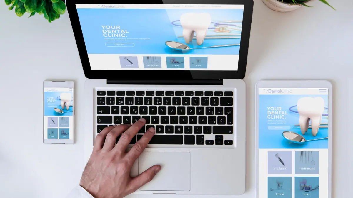
The majority of new patient searches happen on a phone. If your website loads slowly, the text is too small to read comfortably, or the booking button is hard to tap, you are losing patients before they ever see your actual content. Test your own site on your phone the way a nervous new patient would.
The Bottom Line
A dental website that converts is not necessarily the most beautiful one. It is the one that makes a clear case for one procedure at a time, removes confusion about what to do next, and builds trust exactly where decisions are being made. If your phone is not ringing the way it should, the design is rarely the real problem.